Jane Austen’s Emma
10/2019
︎ Layout design
︎ Adobe InDesign
︎ Traditional book layout
The final project for typography was to select and lay out an old text in the Van De Graaf canon, a grid used in the layout of texts printed in the golden age of the printing press. The white space on the page not only allows readers to comfortably hold their book but also allows for a continuous reading experience through the entirety of the text as the canon reflects the natural movement of the human eye.
See the whole project here︎︎︎
![]()
![]()
![]()
![]()
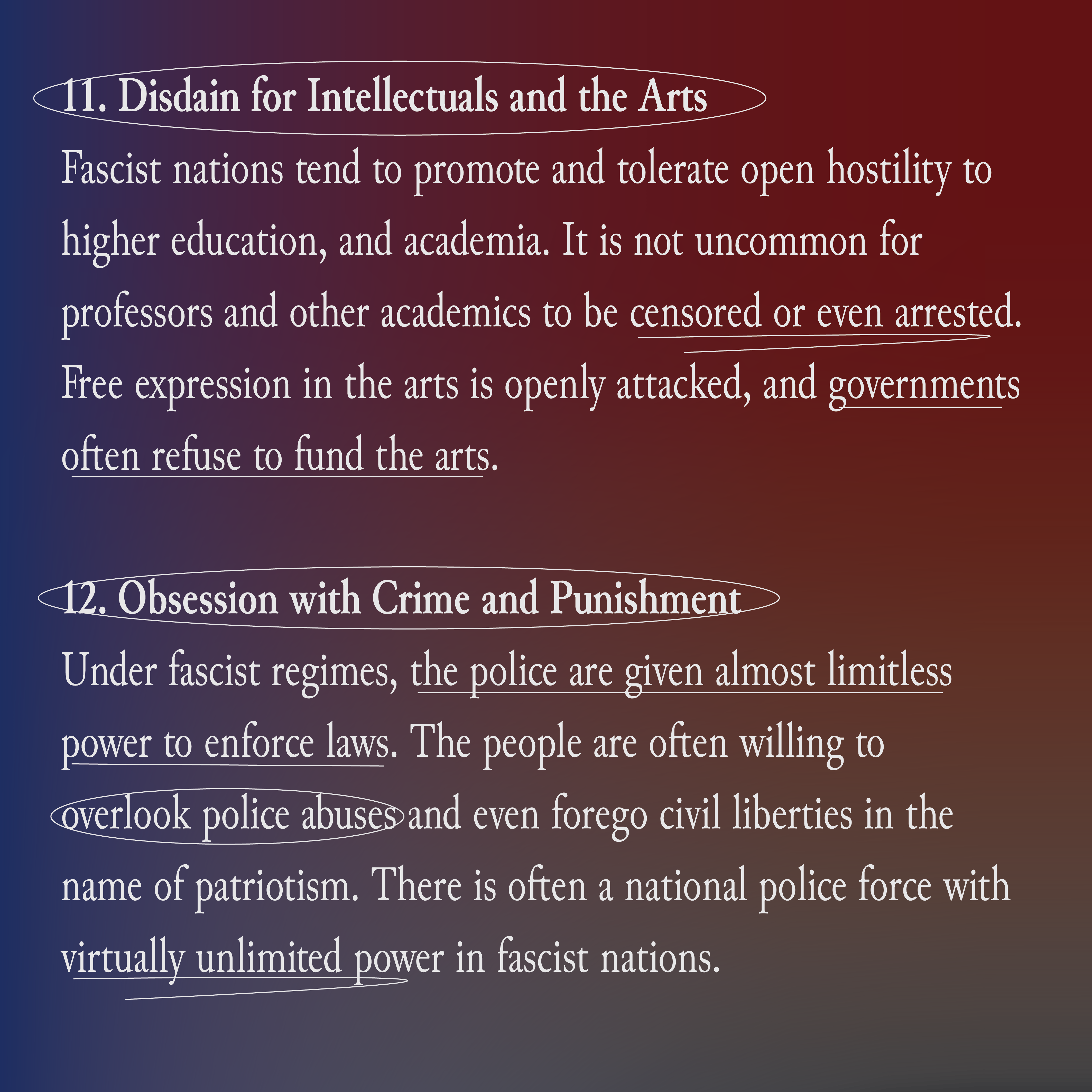
![]()
![]()
See the whole project here︎︎︎